Paying online does not mean the desk visit goes away
The fee cleared online. The email said approved. The resident still stood in line because the stamp, badge, or wet signature never moved online with the payment.
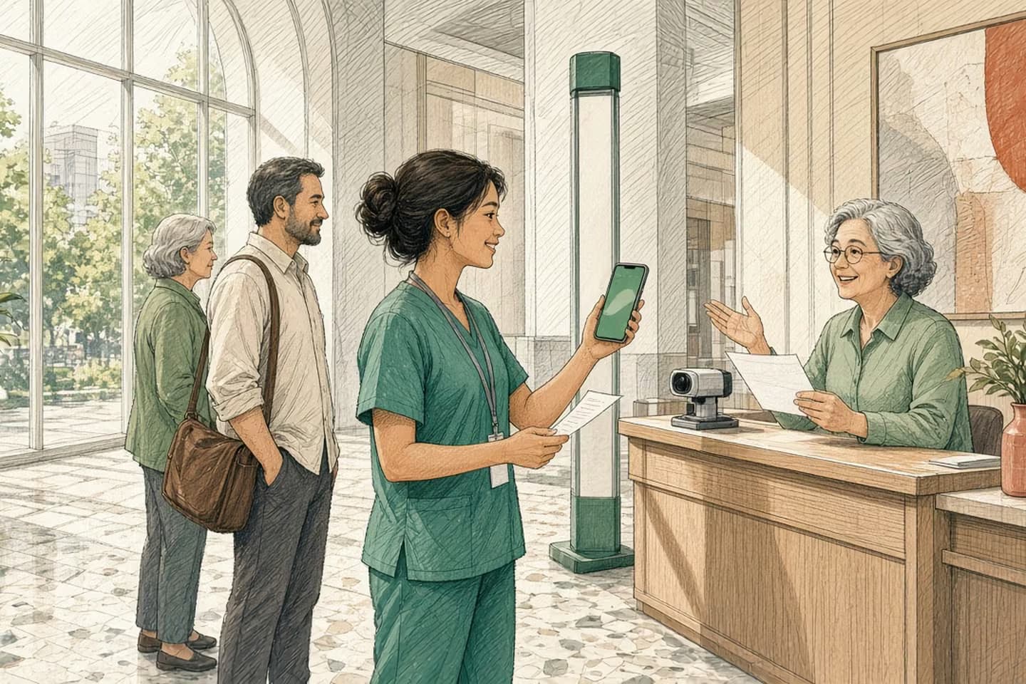
When a government or public service takes payment online, spell out which steps still require an in-person visit, what to bring, and how the online receipt maps to the desk ticket. Do not imply the whole service is finished when only the fee is collected.
The gap
Someone pays a permit fee, license renewal, or records charge online. The portal shows a green check. Two days later they wait at a counter because the credential still needs a photo, a stamp, a notary, or a pickup window that never appeared in the confirmation email. A paid fee is not a finished service until the desk step is named.
This pattern shows up wherever a public body bolted payment onto an older counter process. Finance got a cleaner deposit. Residents got a sentence that sounded like completion. Clerks inherited a Monday line of people holding phone PDFs and asking why they are still there.
Sequence of work
Payment vs finished service
- Apply
Form submitted; application number issued.
- Pay online
Fee captured; receipt available.
- Desk step (if any)
Identity, stamp, inspection, or pickup—named in the confirmation.
- Complete
Credential or result issued; status matches portal and counter.
Say the remaining steps where the charge happens
On the payment confirmation page and the email that follows, list four things in plain language:
- What is complete (fee received, application number issued).
- What is not (in-person identity check, inspection, badge print, wet signature, document pickup).
- Where to go, which desk or kiosk, what hours, what to bring, and a honest time range—not a false promise of "five minutes."
- How the online receipt is shown at the counter (QR code, PDF, application number read aloud).
If there is no remaining desk step, say that too: "No visit required. Your document will arrive by mail / download in N days." Silence is what creates the confused line. A green "Success" alone is not a service map.
Decision guide
Confirmation that stops early vs confirmation that finishes
| Consideration | Payment-only confirmation | Service-path confirmation |
|---|---|---|
| Message | Thank you; paid. | Paid; here is what remains and what to bring. |
| Desk | Surprised residents with printouts. | Clerk scans the same receipt the portal issued. |
| Status | Paid ≠ complete, but UI says success. | Shared statuses through the last step. |
| Calls | "I already paid—why a line?" | Fewer status calls; clearer visits. |
A paid fee is not a finished service until the desk step is named.
Design the counter for the digital receipt
Clerks need a lookup as fast as cash used to be. Application number or QR should open the same status the resident sees. If the desk still types names into a second system that does not know about the payment, you have two sources of truth and a new class of "I paid but you can't find me" disputes.
Prefer a short shared status vocabulary: submitted, paid, needs visit, in review, complete, rejected. Portal and counter both read it. Our note on where-is-my-application calls is the same idea for status anxiety; here the trigger is payment that looked final.
Train the desk script: "I see your payment. The next step is X. Here is what I need from you today." When the online copy and the spoken copy match, trust holds even if a visit remains.
What to strip from the confirmation. Remove language that implies the whole service is done when only money moved. "You're all set" is a trap if a stamp remains. "Payment received" is accurate. Pair it with "Next: visit City Hall room 120 with photo ID." Put the next step above the fold, not in a footer FAQ.
Also strip surprise fees at the desk for the same service. If a "processing" cash fee still applies after online payment, disclose it before the card is charged online—or eliminate it. Residents remember the double ask more than they remember your portal vendor.
Measure the wrong line. If you only track online payment conversion, you will celebrate while the lobby fills. Add a simple operational check: count visits tagged "already paid online," and sample whether those visitors had a clear next-step email. A week of that sampling beats another homepage banner about "pay online in minutes."
When you redesign, involve a clerk who works the Monday rush—not only the payments project team. They know which documents people forget and which QR codes fail in sunlight.
Worked example: renewal that still needs a photo
Imagine a composite city dog license renewal. The resident pays online Sunday night. Monday the confirmation says "Approved." Tuesday they learn a current photo is required at Animal Services between 9 and noon with the payment receipt. Nobody told them Sunday. They take lunch, wait, and leave irritated—even though the fee part worked perfectly.
Now rewrite the Sunday email: "Payment received for license #48219. To finish, bring a photo ID and this receipt to Animal Services, 120 Main, weekdays 9–12. Average visit: 15–25 minutes when you arrive before 11. No second fee." Same payment rails. Different trust outcome.
If your stack cannot show that text because payment and permitting are different vendors, the integration gap is the product problem. Either pass the next-step content through the payment confirmation API, or stop calling the payment screen the end of the service. Residents do not care which contractor owns which screen.
Channels matter too. SMS receipts that only say "Paid $" without the desk instruction recreate the lobby problem on a phone. Include the next step in every channel that announced success: email, SMS, PDF, and on-screen.
Staffing the desk for online payers deserves a separate line on the operations calendar. Online payment often shifts arrivals into lunch hours and Saturdays. If you celebrate digital adoption without adjusting desk coverage, you invented a new queue.
Procurement and vendor splits
Many agencies buy a payments widget from one firm and a permitting workflow from another. The contract for payment may be "done" when funds settle. The resident experiences one service. Put acceptance criteria in both contracts: confirmation content, shared status fields, and desk lookup. Otherwise each vendor points at the other while the lobby fills.
Accessibility of the next-step instructions matters. PDFs that are only images, or QR codes without a numeric fallback, fail for someone. Offer the application number in plain text every time.
Put this into practice
Online payment is progress only when the rest of the path is honest. We build government and public sector services that name every remaining human step beside the charge. If your confirmation email stops at thank-you-for-your-payment, talk to us.
Publish the desk-step map on the service page before payment, not only after. People decide whether to start based on the whole path. A resident who knows a visit is required can bring documents the first time. Surprises after payment feel like bait even when nobody intended that.
When the desk step is seasonal—tax peaks, school enrollment—publish temporary hours on the confirmation template, not only on a homepage banner people already passed.
Related work: Wellthie.
We build alongside the people doing the work.
Bring us the problem you’re thinking about.