Safari is about to offer a dark version of your website. Look at your logo before December
Safari 27.3 adds Adaptive Dark Mode, which repaints bright sites for people who browse in Dark Mode, logos and graphics included. Walk your best page through it now and decide whether to leave it, build your own dark theme, or opt out.
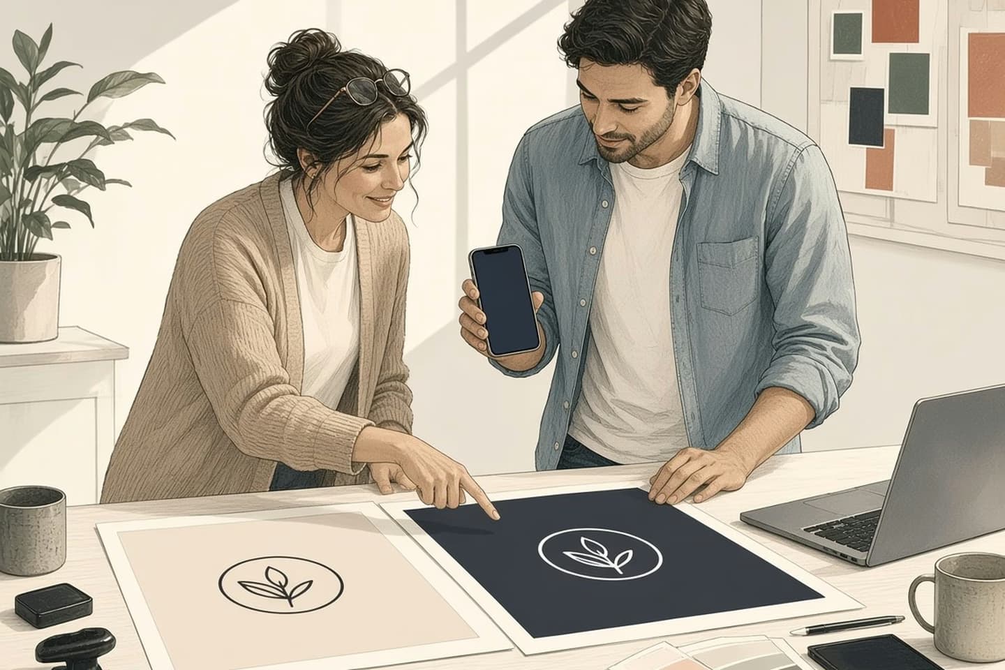
Yes, Safari will soon be able to darken your site for you. Safari 27.3, in beta since November 3, 2026 and expected in December, adds Adaptive Dark Mode for pages that don't natively support dark mode. It darkens backgrounds, tunes text contrast, inverts logos and graphics as needed and recolors vector art. Check your most important page, then leave it, build a native dark theme, or opt out once Apple documents the tag.
Your site is getting a night shift you didn't design
Picture someone reading your homepage in bed with their phone set to Dark Mode. Today they get your site the way you built it, bright white and all. From December, Safari may offer to repaint it for them.
Apple shipped the first beta of Safari 27.3 on November 3, and the release notes include one line that matters to anyone with a website: Safari "Added Adaptive Dark Mode, which automatically adapts bright web pages that don't natively support dark mode."
The key words are "don't natively support dark mode." If your site already has a proper dark theme, this isn't aimed at you. If it doesn't, and plenty of small-business sites don't, Safari is about to start making its own guesses about what your site should look like at night.
That's not a disaster. For a lot of plain text pages it will probably be a nice improvement for readers. But it's worth knowing what Safari changes, because the parts it changes are the parts you paid a designer to get right.
What Safari actually does to the page
Here's what's been reported so far, from the beta and Apple's own descriptions.
When someone with Dark Mode turned on visits a site that doesn't support it, Safari shows a "Try" option, according to MacRumors. AppleInsider describes it as an alert at the top of the page. Tap it, and Safari builds a dark version on the spot. Readers can let it kick in automatically or turn it on site by site.
According to AppleInsider's write-up, the feature will darken light backgrounds, tune the text contrast, invert logos and graphics as needed, recolor vector artwork, and rebalance layered shadows on complex layouts. It uses Apple Intelligence to look at each site individually, so it needs an Apple Intelligence device. The updates are expected to reach people in December, after more betas.
Read that list again with your own site in mind. Backgrounds and text are the easy part. "Invert logos and graphics" is the one that should make you pause. Your logo was designed to sit on a particular color. Inverted, a dark wordmark may turn into a pale one, which is often fine. A two-color mark, a logo baked into a photo, or a badge with a white box around it can come out looking odd.
Product photos are the other worry for a store. A beta can change a lot, and we don't know yet exactly how careful Safari will be with photos versus drawn graphics. That's exactly why it's worth looking at your own pages rather than trusting anyone's general prediction, ours included.
Decision guide
What Safari is reported to change
| Consideration | What Safari adjusts | What to look at on your page |
|---|---|---|
| Backgrounds | Light backgrounds are darkened. | Images with white backgrounds that now look like bright boxes. |
| Text | Text contrast is tuned. | Gray captions, prices and fine print that were already faint. |
| Logos and graphics | Inverted as needed. | Two-color marks, logos inside photos, badges on white boxes. |
| Vector artwork | Recolored. | Icons and illustrations whose colors carry meaning. |
| Shadows and layers | Layered shadows rebalanced. | Cards, menus and cart drawers that should still stand apart. |
Backgrounds and text are the easy part. Your logo was designed to sit on a particular color.
Walk one page through it, piece by piece
You don't need to audit the whole site. Pick the page that earns you money, usually the homepage, your main service page, or your best-selling product, and go through it in this order.
The header and logo. This is the first thing people see and the thing most likely to invert. Ask whether your logo would still read as your brand in white on near-black. If you have a light version of the logo somewhere in a brand folder, you're in good shape.
Buttons and links. Your main call to action probably relies on color. Check that the button still stands out when the page around it goes dark, and that link colors don't sink into the background.
Photos and illustrations. Look for images with a white background that was meant to blend into a white page. On a dark page, those become bright rectangles. Product shots cut out on white are the classic case.
Forms and checkout. Fields, borders, error messages and the little lock icon near the pay button all lean on subtle grays. Those are the details that go muddy when a browser shifts colors for you.
Anything embedded. Maps, booking widgets, review badges and payment forms come from other companies. Some will have their own dark styles and some won't, so a page can end up half dark and half bright.
If you have an iPhone, iPad or Mac that can run the 27.3 beta, you can look for yourself. Most owners won't want to install a beta on the phone they run the business from, and that's sensible. In that case, plan the check for December, when the update lands, and do it in the first week rather than waiting for a customer to send a screenshot.
Three ways to respond
Once you've looked, there are really only three choices, and each one is reasonable for a different kind of site.
Leave it. If your site is mostly text, your logo is simple, and nothing important depends on precise color, letting Safari handle it may be the cheapest good outcome. Your readers get a darker page and you spend nothing.
Build a proper dark theme. This is the right answer if your brand lives in its colors, or if you sell things whose appearance matters. A native dark theme means you decide the background, the logo version, the button color and how product images sit on the page. Because Safari only steps in for sites that don't natively support dark mode, doing this properly keeps the decisions in your hands. The standard way to tell browsers which color schemes a page supports is the CSS color-scheme property together with a matching meta tag, plus styles that respond to the reader's preference.
Opt out. AppleInsider reports there is "a tag that they can add that will force the site to appear as-is." Apple hasn't named that tag in the 27.3 release notes yet, so don't guess at it. For what it's worth, the web already has a way to refuse this kind of override from Chrome's similar Auto Dark Theme: MDN says the "only" keyword in color-scheme "Forbids the user agent from overriding the color scheme for the element." Whether Safari respects that or wants its own tag is something to confirm once Apple documents it.
Opting out is tempting, but think about the reader before you choose it. Someone who turned on Dark Mode did it on purpose. Refusing to darken means they get the bright page back, which they've already told their phone they don't want.
How the work moves
Leave it, build it, or opt out
- Pick one page
The page that earns the most.
- Look in dark
Header, button, images, checkout.
- Fine as is?
Leave it and let Safari adapt.
- Brand at risk?
Build a native dark theme.
- Must stay light?
Opt out once Apple names the tag.
Where this gets a little more involved
For a simple brochure site, a dark theme is a contained piece of work. It gets more involved in a few places, and it helps to know them before you ask anyone for a quote.
Sites built on a theme or a page builder may already have a dark option that just isn't switched on. Check that first. It can save you most of the job.
Stores have more moving parts. Product photos, sale badges, cart drawers and the checkout often come from different places, and some of them you don't control. A dark theme that stops at the cart is worse than none, because the jump back to white happens at the moment you most want people calm.
Web apps, portals and booking tools have the most states to cover: empty screens, errors, charts, tables, emails that open in the same browser. That's where planning the colors once, as a small set of named choices rather than hundreds of one-off values, pays for itself.
Put this into practice
Put one item on your December list: open your money page in Safari with Dark Mode on, once the update is out, and look at the header, the main button, the product images and the checkout. Then decide whether to leave it, build a dark theme, or opt out once Apple documents how.
If you'd like a second pair of eyes, our web application development team can review how your site renders in dark settings and build a native dark theme that keeps your brand intact. For stores, our ecommerce work covers the product pages and checkout where this matters most. Tell us about your site and we'll start with the pages that bring in the business.
Related work: Sutton Place.
We build alongside the people doing the work.
Bring us the problem you’re thinking about.